OG Rolls
Worth every bites
Scope
Brand strategy / Brand identity
Industry
F&B
Info
Australia, 2024
The brief
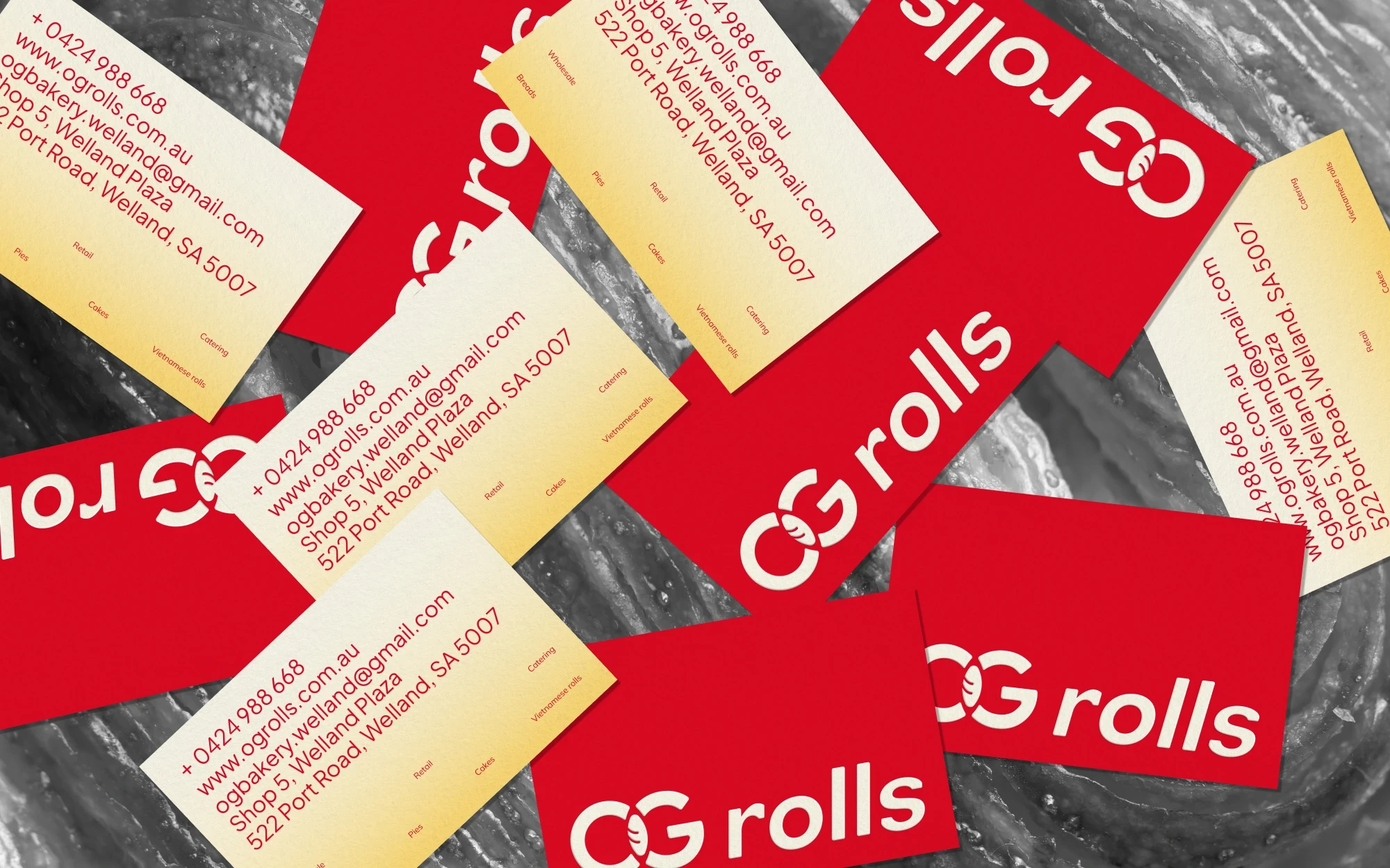
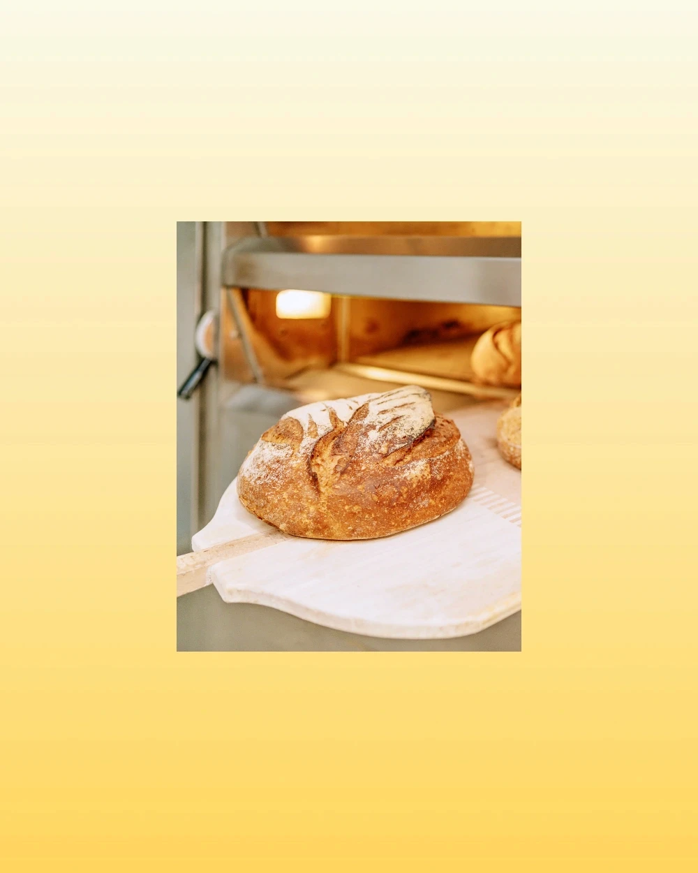
OG Rolls is a neighborhood bakery in Australia, located within a supermarket environment and serving a broad, everyday audience. The brand was already familiar to returning customers, particularly families with low to middle income, who value affordability, consistency, and comfort.
The challenge was to rebrand OG Rolls without losing this recognition - while elevating its presence to stand out among dense, visually competitive supermarket brands.
The challenge
How might we evolve a familiar, functional identity into something more distinctive and engaging - without alienating existing customers? The brand needed to balance two tensions:
Familiar vs. New - retaining trust while introducing a fresh perspective
Accessible vs. Creative - staying affordable and friendly, yet visually strong enough to compete in a crowded retail context
Strategic approach
We positioned OG Rolls around the idea of “freshly baked, everyday” - emphasizing reliability, warmth, and daily relevance rather than occasional indulgence.
From a brand perspective, we leaned into the Everyman archetype: approachable, honest, and down-to-earth. This allowed the identity to feel inclusive and familiar, while still leaving room for a more refined and intentional visual system.
The strategy focused on:
Preserving key recognizable elements from the old identity
Simplifying and clarifying the brand message
Creating a system flexible enough for both in-store visibility and everyday touchpoints

Design direction & process
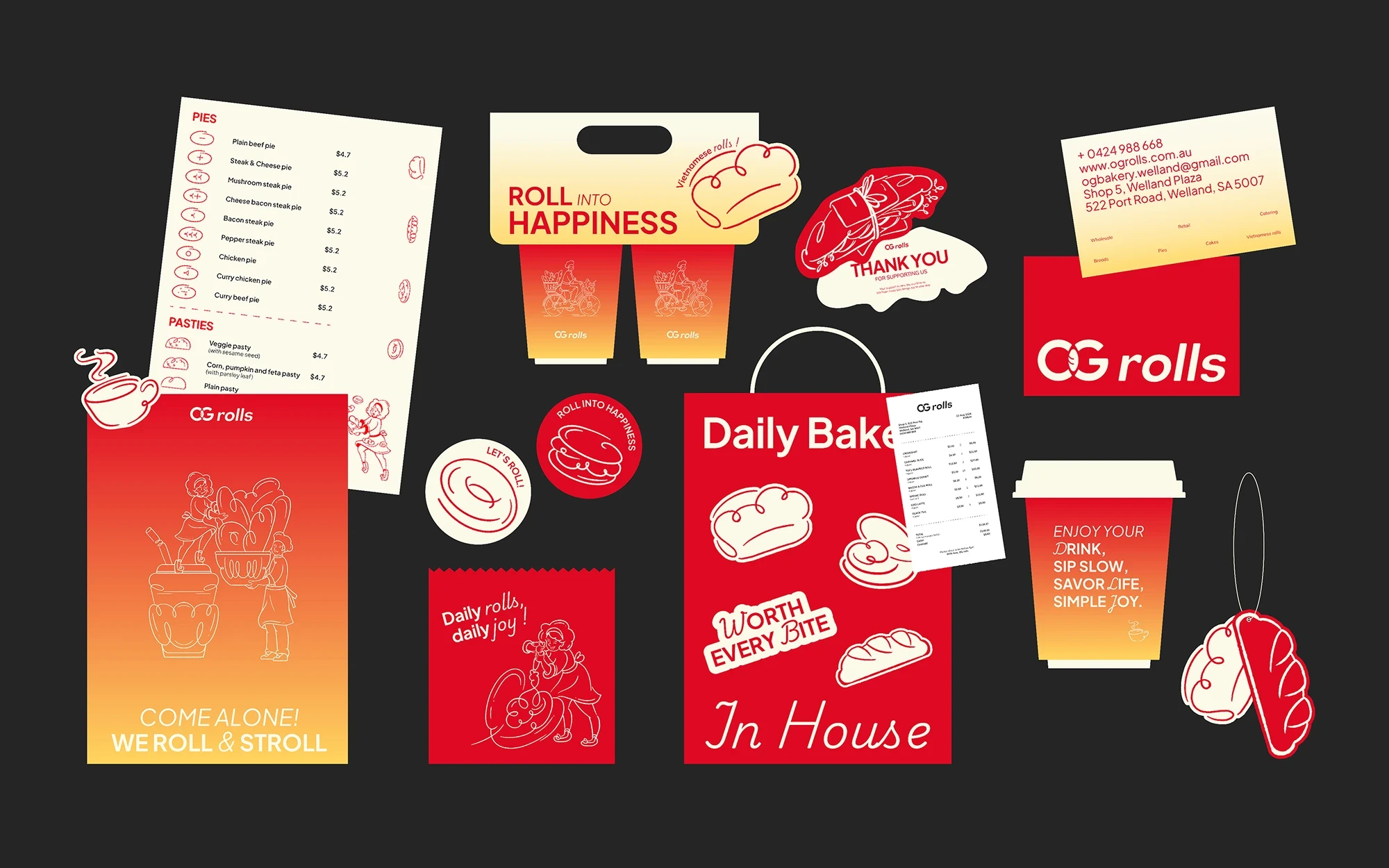
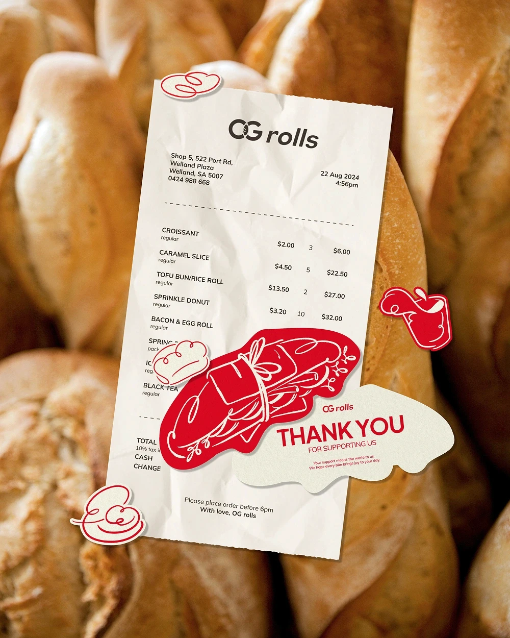
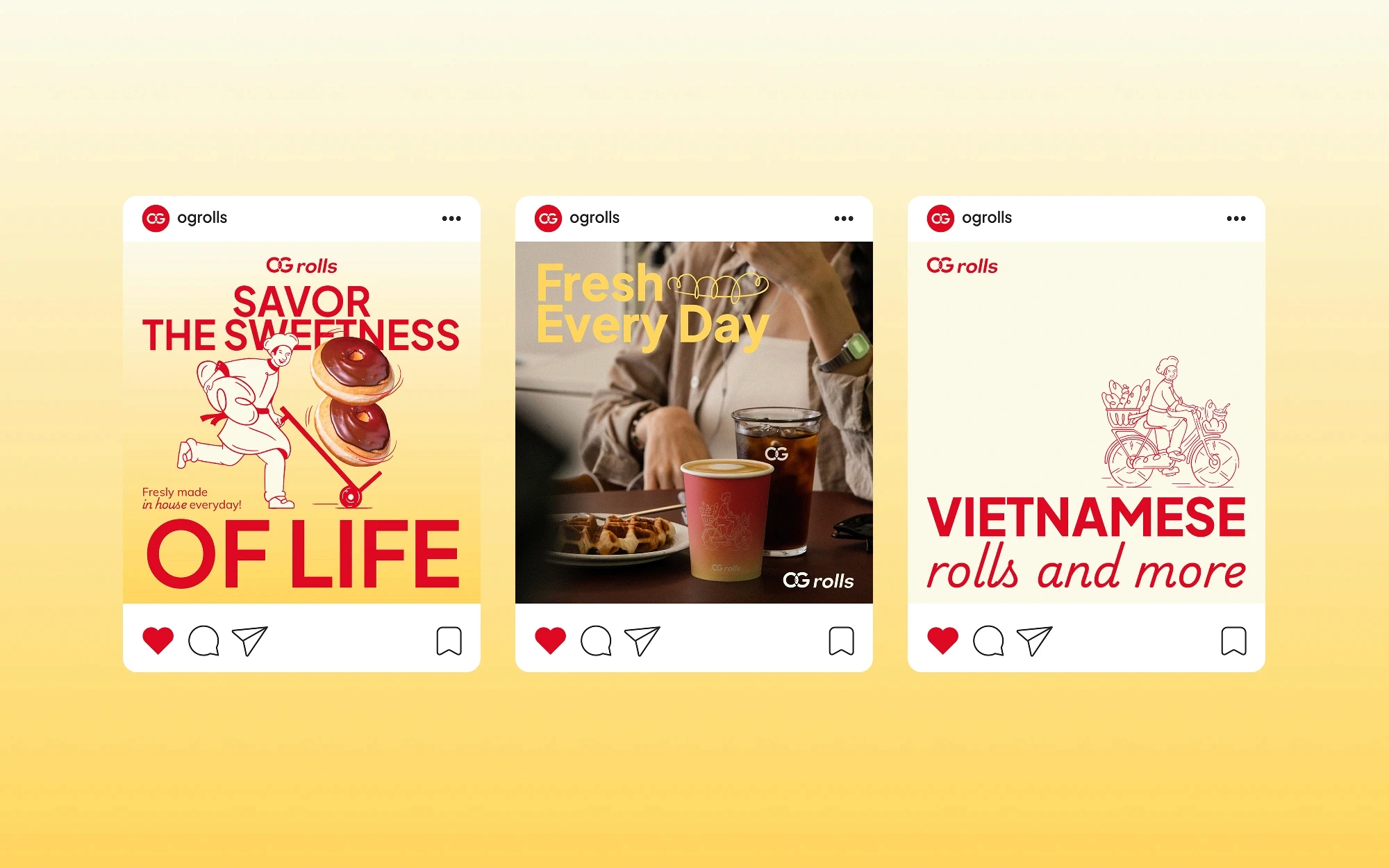
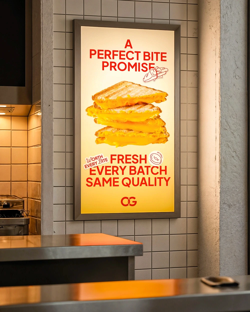
Visually, the system balances warmth and clarity. Bold, warm colors evoke heat, freshness, and appetite, while clean layouts ensure legibility in a fast-paced supermarket setting.
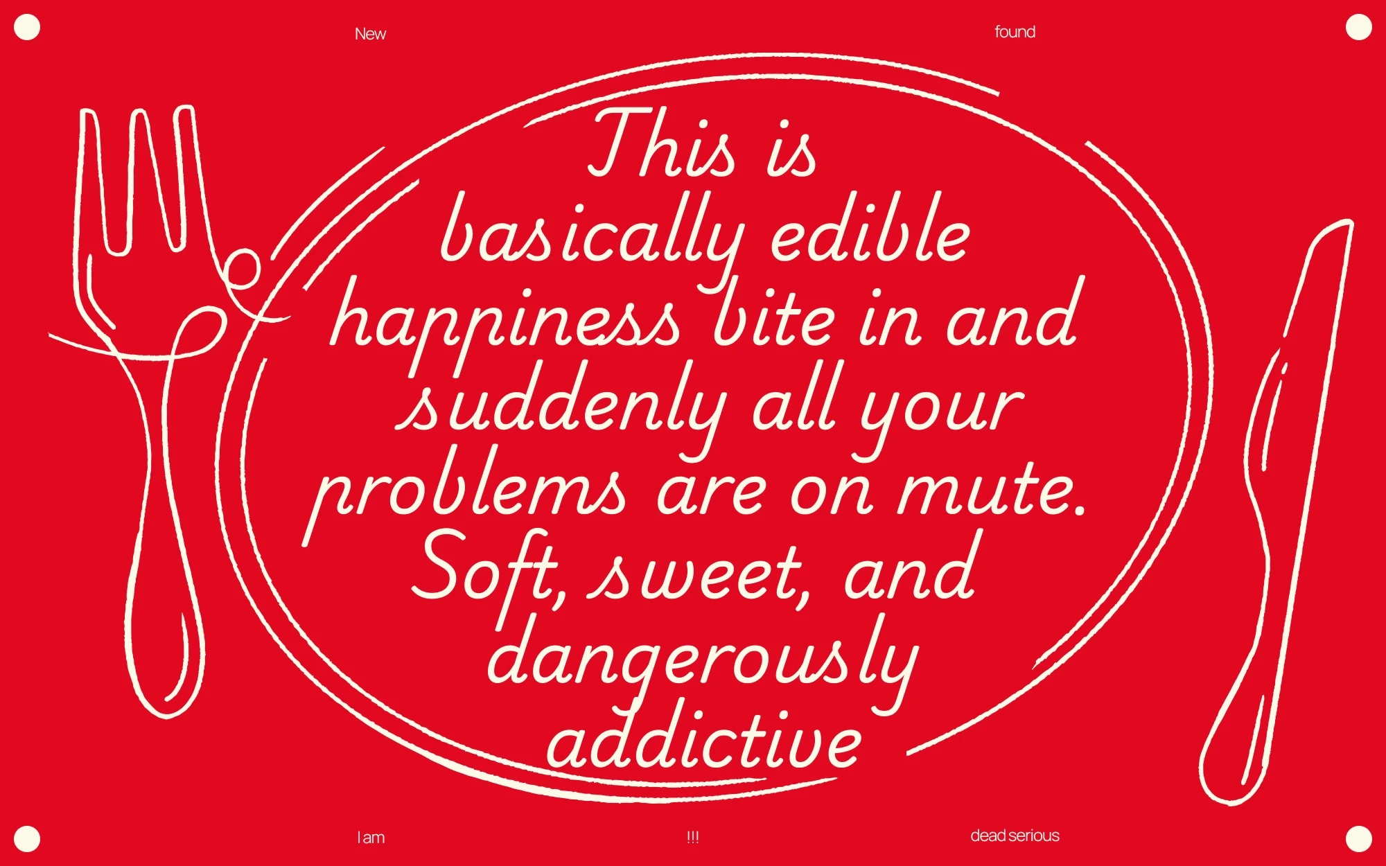
Typography and illustration were directed to feel friendly and human, avoiding anything overly premium or exclusive. The illustration brief played a key role in softening the system - adding character while reinforcing the bakery’s approachable tone.
My role & Outcome
As Team Leader, I was responsible for setting the strategic and creative direction for the entire project - defining the brand positioning, establishing the visual system, and directing a team of 15+ designers, illustrators, and showcase designers across disciplines. My specific contribution covered brand strategy, the core identity system, and art direction of the illustration brief. The "freshly baked, everyday" positioning was developed from the brief stage as a scalable brand idea, not just a tagline - it guided every visual decision from color palette to typography weight. The brand launched successfully for the Australian market and continues to operate.

Credits
Team
VCD Lab
Team leader
Nguyen Hien
Illustrator
Nguyen Ngoc Hoai Thuong / Thai Hong Ngoc
Showcase
Le Huu Tien / Tran Doan Trinh
Art Director
Chieu Anh Long
Brand designer
Nguyen Hien / Nguyen Ngoc Hoai Thuong / Ha Tung Lam / Poyo / Han Ngo
Graphic designer
Nguyen Phan Quynh Nhu / Nguyen Nhat Vy / Huynh Nguyen Gia Tri / Huynh Thi Thao Nguyen / Le Ngoc Thao Trang / Le Ngoc Ha Vy / Nguyen Duong My Le / Nguyen Thanh Tin / Nguyen Le Bao Han / Kado / Huynh Yen Nhi / Tran Quang Huy